
Tuesday, May 4, 2010


Monday, April 26, 2010
Week 14
Poster for a Cause: I have chosen the group Equality Now as the group that I'd like to focus on and their work in woman's rights, especially those of human trafficking. The piece of art called "Broken" was created by Antony Micallef who created this for an art project called "Journey" bringing awareness to the Sex Trafficking of girls. This is currently touring in the UK.
 After completing my final project and solidifying the logo, I recreated the poster. Here it is with some modifications:

Tuesday, April 20, 2010
Week 13
My Color Wheel:


I have done this test in another class before. I thought I had done very well the first time, but didn't. This time, I took a different approach, and it was much easier! Fun test!
Wednesday, April 14, 2010

Thursday, April 1, 2010
Week 11_2
ILLUSION OF SPACE:

1. Amplified Perspective. This is when the image is pointed directly at the view, so the image is not the 'typical' angle. A dynamic quality is held by these images. One of my favorite artists is Juan Francisco who draws many pictures with amplified perspective, and all with a bic pen: Here are some examples and then one image with a person in it to give you a better idea of size. 


1. Equivocal Space. There is no clear spatical pattern, and this ambiguity is what defines the equivocal space. I feel like i see this frequently in photographs, but not as often in painted or drawn art. I found an example of each:

3. Open Form. The open form is when an artist has given only a partial glimpse of a scene that then would continue beyond the format. There are very clear examples, but I chose one that I liked. At first was going to be a closed form, but the more I looked at it, there is no defined rectangular format, and has no contained feeling. The paint lines extend outward away from the duck. This piece is a linocut print by Kate Nydam Meberg.
ILLUSION OF MOTION
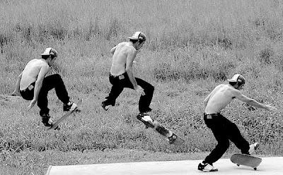
2. Multiple images. This photograph is by Eliot Ellisofon.
There is a suggestion of movement because of these multiple images. There is slight change in the successive position of these overlapping images.

1. Equivocal Space. There is no clear spatical pattern, and this ambiguity is what defines the equivocal space. I feel like i see this frequently in photographs, but not as often in painted or drawn art. I found an example of each:

From http://www.palartworld.com/
And the next titled CourtHouse Reflection is a Flicker post by gstuessi's photostream:
3. Open Form. The open form is when an artist has given only a partial glimpse of a scene that then would continue beyond the format. There are very clear examples, but I chose one that I liked. At first was going to be a closed form, but the more I looked at it, there is no defined rectangular format, and has no contained feeling. The paint lines extend outward away from the duck. This piece is a linocut print by Kate Nydam Meberg.

1. Blurred Outlines: This image was taken  from Smashing Magazine. This illusion of motion is done with our interpretation of a photograph or painting that has blurred outlines as a symbol of movement. When there is movement in out vision, it isn't seen as accurately, and we see a blur. The edges are blurred and we lose some of the detail. I love this picture, the subject is actually the thing that isn't as blurred. A little different take on it- the back ground is moving, and the fur on this pups head!
 from Smashing Magazine. This illusion of motion is done with our interpretation of a photograph or painting that has blurred outlines as a symbol of movement. When there is movement in out vision, it isn't seen as accurately, and we see a blur. The edges are blurred and we lose some of the detail. I love this picture, the subject is actually the thing that isn't as blurred. A little different take on it- the back ground is moving, and the fur on this pups head!
2. Multiple images. This photograph is by Eliot Ellisofon.


3. Figure Cropped
This image by Darin Mcquoid is a great cropped example. This is a way to express motion by using the composition effectively to give the suggestion of motion. In this picture, the image is cropped so that the kayak is in the lower right corner pointing slightly left to follow the flow of the river. The way it is cropped give the viewer a feel of tipping forward as the kayak is about to fall.
Week 11_1
The first I chose is aerial perspective, or atmospheric perspective. I thought of using a photograph since mountains are a great way to show this perspective, but instead thought it might be interesting to try and find it in a painting. 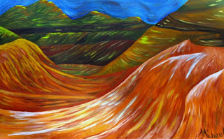
This Painting is by Micheal Arnold. This perspective uses color to show depth. There is clear value contrast between what is distant and what is closer. Although these aren't traditional colors, I think this artist was able to create depth with his use of color.
 My next image is my example of Overlapping in this image by Gwenda Kacz. Overlapping is a simple way to create depth by laying elements on top of each other. The overlapping shows their relationship to each other.
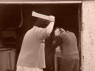
This is the image I chose for Anticipated motion. I think the image speaks for itself- the anticipated motion would be the hitting of the child.
I found this photograph at an organization for children by youth:
I at first got this image assuming it was figure repeated, but I don't think it follows the guidelines close enough.

This Painting is by Micheal Arnold. This perspective uses color to show depth. There is clear value contrast between what is distant and what is closer. Although these aren't traditional colors, I think this artist was able to create depth with his use of color.
 My next image is my example of Overlapping in this image by Gwenda Kacz. Overlapping is a simple way to create depth by laying elements on top of each other. The overlapping shows their relationship to each other.
This is the image I chose for Anticipated motion. I think the image speaks for itself- the anticipated motion would be the hitting of the child.
I found this photograph at an organization for children by youth:

I at first got this image assuming it was figure repeated, but I don't think it follows the guidelines close enough.
I also am not sure it fully falls into multiple image, since the requirement of this is overlapping sequence. Although not overlapping, I believe this may fall into the category of multiple images.
This image comes from an online photography school and can located at:
Thursday, March 18, 2010
Week Eight
 VOLUME
 The top left image I used a couple different medias, but the think black 'paint' was helpful to give it a chunky, heavy feel.
The top right I went with a different approach and used the squiggly lines on the front of the frames to show volume.
Volume III on the bottom left seems to have all it's weight in the bottom half, and gives and airly feel.
The bottom right I used a heavier medium and then filled in shadows and detrains to add weight.
 CONTOUR
The top left is the contour drawing. I just followed the deges of the form to create the outline that I saw.
The top right is a Blind Contour drawing of the same object (glasses).
The bottom two are gesture drawings. Although there is no movement to this image, I'm hoping that the gesture drawings give a slight feel of movement with this effect.
 EMOTIONS
The top left is the emotion of feeling Focused. The percise lines and attention to detail gives a studious feel.
The top right is nervous. I used bolder, darker lines to show more intensity, and then the wavy nature I hope conveys an uneasy, nervous feel.
Distracted, with medium lines, and 'forgetting' some other parts of the drawing- gives the feel that something is missing...
Angry is the last one. The lines are jagged and frustrated! Some of the lines are controled while others are not.
 VERBS
VERBS
 VERBS
VERBSThe top left image is 'to skate'. The sqirly and loose lines show the sort of movement of an ice skater.
To Sleep is the top right hand side image. The lines here are white on a black background with simple form. The color and simplicity were to create the feeling of sleep.
The Bottom left verb is 'to scream'. The lines here are jagged and filled with black.
The last one is 'to study'. I hope that the lines, overlapping and yet still somewhat percise, convey the scattered yet hardworking feel of a student hard at work.
Monday, March 8, 2010
Week Seven
 This is a self portrait, I'm the one in the hat. I chose this image because it's recent and I liked the asymmetrical balance of the image. I chose it to be in black and white because then the large dark space to the left pulls down that side with the lighter image to the right. Although not centered, it has a balance with the black and white. In color, the color made it extremely heavy to the right and felt awkward. I would hope that this image portrays my somewhat artsy side, along with love for my dog and the Red Sox.
It feels like a quick clip of information, such as an abstract or introduction. Principles that I incorporate in this image begin with the balance discussed earlier. The tilt of our heads creates a focal point of the "v".
 This "v" also gives a rhythm, it seems to squeeze together at the bottom of the image, this could cause a psychological feeling of hugging. The dark background forces the rest of the image into unity, just through the fact that there is detail and light.
The unity is also expressed in
 continuation with a line that seems to go from the left eye of Oliver (the dog), gently up between my eyes to the 'x' in my baseball hat. This is the main principle that draws me to this image.
Tuesday, March 2, 2010
Week Six

RHYTHM - Touch
Select four words related to the sense: Sticky, Prickly, Slime, Abrasive and one "smooth" with progressive rhythm.


Select four words related to the sense: Sticky, Prickly, Slime, Abrasive and one "smooth" with progressive rhythm.


Monday, March 1, 2010
Week Five


Positive Image (my digital camera isn't the best-please forgive the fuzziness!) and Negative Image!
Monday, February 15, 2010
Week Four

Scale Assignment- Three elements are the background with fish, the peole and land on bottom and the moon.
Friday, February 5, 2010
Week Three
 Contrast: Differing elements draw focus to one piece of the art work. I chose these two, the photograph by Chloe Aftel, found in
  Communication Art Website. The bright sunlight hitting her hair arms and face, draw the viewers eyes right to it. The second piece by James Wignall was found at the design site:
  http://www.mutanthands.com/. There are more than one contrasting element in this one. The color was the first one that jumped out at me. A cool blue monster, in a completely red background. After a closer look, the monster has rounded edges and the rest of the elements are sharp.
Isolation: An element can be isolated by location, placement, or other variables.
 In this photo, the isolation of the plane away from all other darker objects in the image creates the focus. The photo is by David Smith.
This next piece by Justin Fox
 (http://www.justinfox.com.au/), uses isolation in a different way. The focus of the is drawn to the element that is clo
 sest in position. The background falls away to create the focal point. This is quite a variation from the previous photo.
 Placement: Another piece from Justin fox, this time a photograph, is an example of placement to create a focal point. Here the woman's legs are in the center of the piece, the top of them cuts the center of the bed horizontal line, also they fall between her arms.
 The photograph on the right, is by Rebecca Bedrossian, has an interesting take on 'placement'. The black circle is directly over the woman's face,
  causing the viewer to try to decipher the woman's features, drawing their eyes to the empty hole.
Element: The artist Antony Micallef made the piece below, it can be found at his site: http://www.antonymicallef.com/

The focal point is created with different media in
 the piece. The face of the boy is created out of some colorful paint or pastels. This contrast with the black and white 'drawings' in the background give a clear focus.
Absence of focal point: was the most difficult for me. I found that I really don't enjoy the piece at all. It feels chaotic and empty. This piece above right, Michael Kopietz is an example of this. If you enjoy this work, more can be found at: http://www.kopietzart.com/kopietzart.com/home.html

Subscribe to:
Comments (Atom)